
Timeless Colonial Home Colors: Historic Paint Palettes That Last
Colonial homes often featured muted earth tones derived from natural pigments available to early settlers, reflecting both practicality and regional resources. Iron oxides, lime, plant-based dyes, and hand-mixed oils shaped colors that stood up to weather, wore beautifully with age, and became part of the American landscape. From the cypress-rich bayous of Central Louisiana to breezy Gulf South settlements, climate and local materials guided every shade brushed onto siding, shutters, and interior paneling. Warm ochres, soft umbers, smoky grays, and dusky blues did more than decorate; they protected wood, cooled interiors, and framed porches and doorways with quiet character. Over time, these grounded, hardworking colors turned into a visual language that still feels right on Colonial exteriors and interiors today. Modern homeowners across the country continue to lean on these historic palettes, blending traditional body-and-trim pairings with accents that honor the past while handling sun, humidity, and heavy use. Moisture-resistant paints, advanced finishes, and carefully matched historic hues now make it possible to capture that timeless Colonial charm without sacrificing performance. From weathered clapboards to paneled halls and stairways, the most enduring Colonial color schemes share the same roots: harmony with the landscape, respect for craft, and a focus on lasting beauty. Historic paint palettes for Colonial homes offer a path to classic style that never feels trendy, only steady, rich, and deeply connected to place.
Quick Navigation:
Colonial Color Foundations: Pigments, Climate, and Local Resources | Classic Colonial Exterior Palettes That Endure | Timeless Interior Colonial Color Schemes for Modern Restorations | Frequently Asked Questions
Colonial Color Foundations: Pigments, Climate, and Local Resources
Beyond the familiar earth tones and hand-mixed hues, Colonial color choices grew from a careful reading of landscape, weather, and materials on hand. Salt air near coastal ports pushed builders toward finishes that resisted fading, while shaded forest settlements leaned into deeper, more resin-rich coatings that stood up to damp conditions. Mineral content in local clays, stone, and soils shifted the undertones of paints from one region to the next, giving each community its own subtle color signature. These practical, place-based decisions created the true foundations of Colonial palettes, shaped by pigments, climate, and local resources alike.
Natural pigment sources in early American settlements: iron oxides, lime, and plant-based dyes
Natural pigment sources in early American settlements came straight from the ground, the lime kiln, and the garden. Iron oxides in local clays produced reliable reds, russets, and soft browns once ground and mixed with linseed oil, ideal for siding, shutters, and doors that needed extra weather resistance. Lime, burned and slaked from oyster shells or limestone, created brilliant whitewash that brightened dark interiors and reflected heat on verandas and porches, especially in humid regions like Central Louisiana. Plant-based dyes added softer accent tones: indigo for gray-blue trim, walnut hulls for deep brown stains, and berry or bark infusions for muted rose and tan. Blended together, these pigments anchored Colonial homes to their specific soil, water, and climate conditions.
Interesting Fact: Historic colonial homes in the American Northeast often featured muted blue and gray palettes influenced by British and Dutch settlers, symbolizing regional cultural exchanges in architecture and design.
Source: Wikipedia
Gulf South and Central Louisiana influences on Colonial palettes: humidity, sun exposure, and cypress-rich landscapes
Colonial palettes in the Gulf South, especially across Central Louisiana, adapted to constant humidity, intense sun, and dense cypress forests. High moisture and heat pushed darker iron-oxide reds and browns onto lower walls and foundations, helping hide mildew and mud from the Mississippi and Red River floodplains. Lime-washed upper walls stayed lighter to reflect harsh sunlight bouncing off bayous and open fields. Near Alexandria and along the Atchafalaya basin, cypress siding and beams brought warm gray-greens and soft browns into exterior schemes, often echoed in trim and shutters. Deep indigo blues and mossy greens contrasted with the silvery tones of weathered cypress, creating shaded, cooler-feeling galleries and porches that held up against Gulf storms and long Louisiana summers.
Functional color choices for wood protection: limewash, linseed oil paints, and tar-based finishes
Functional color decisions in Colonial settlements often followed the most durable wood protection methods on hand. Limewash, made from slaked lime and water, produced soft whites and pale tints that sealed porous wood and masonry while allowing moisture to escape, perfect for siding and outbuildings that needed to breathe through seasons of rain and heat. Linseed oil paints, ground with iron oxides or other natural pigments, soaked deep into wood fibers, creating rich reds, warm browns, and deep greens that resisted cracking and peeling. Tar-based finishes, blended from pine tar or pitch and sometimes darkened with soot, coated sills, posts, and waterfront timbers in nearly black browns, shielding them from rot, insects, and standing damp around foundations and wharves.
Classic Colonial Exterior Palettes That Endure
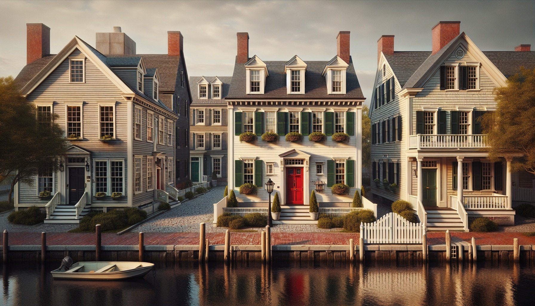
As those grounded pigments settled into American towns and countrysides, certain exterior combinations began to stand out as true mainstays. Whitewashed siding paired with deep, confident door colors, trim in strong contrast to clapboards, and shutters that framed windows like clean “picture lines” became quiet signatures of Colonial design. These palettes balanced order and warmth, giving simple forms a sense of structure and welcome. From village greens in New England to riverfront streets in places like Alexandria and natchitoches, these classic color pairings proved flexible enough to suit changing tastes while still holding fast to their historic character.
Good to Know: Modern reproductions of colonial paint palettes now incorporate low-VOC formulas, allowing homeowners to achieve authentic looks without the health risks associated with traditional lead-based pigments.
Source: This Old House
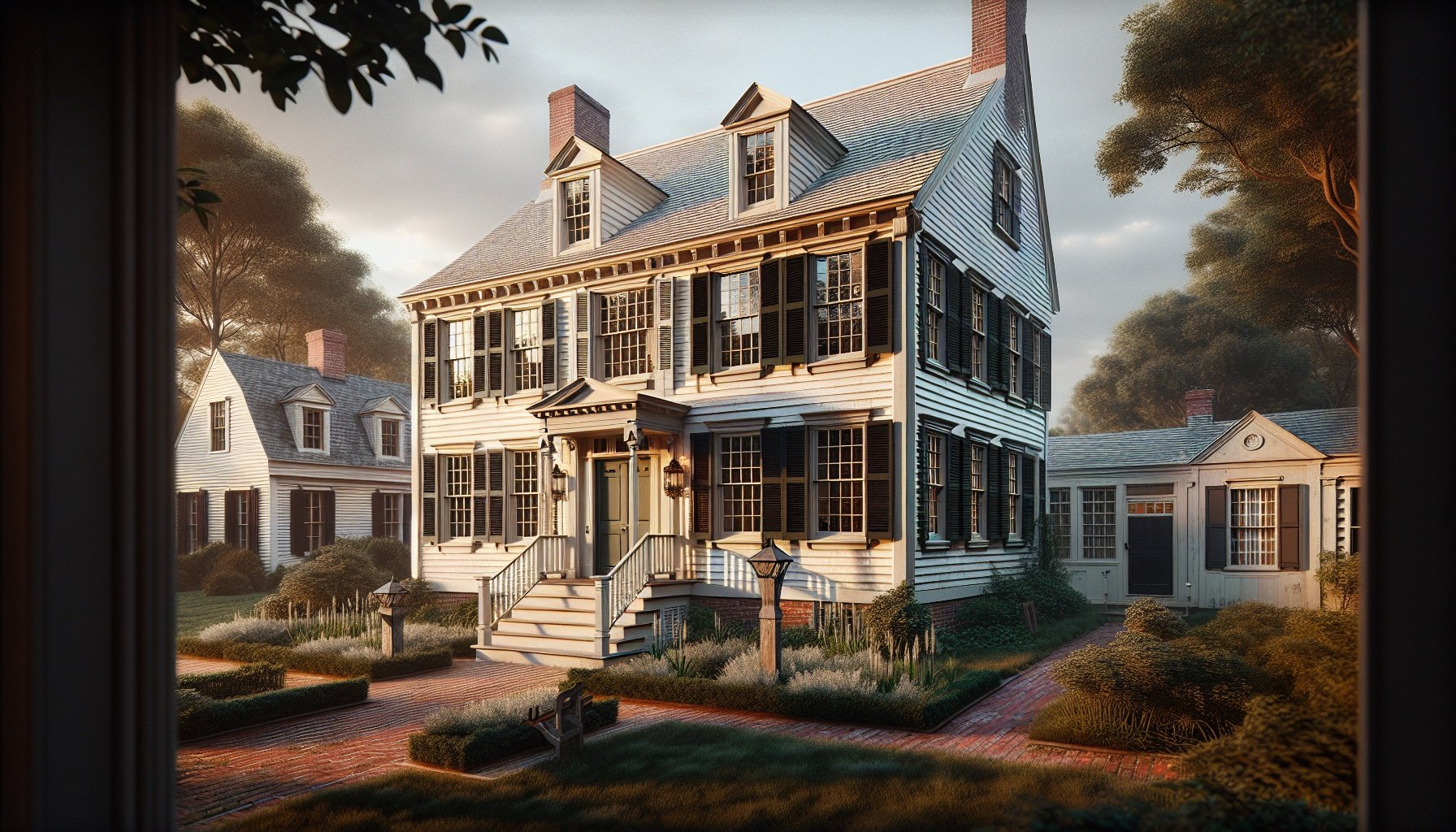
Traditional body, trim, and shutter combinations: deep body colors with crisp light trim
Traditional Colonial exteriors often relied on a strong contrast between a deep body color and crisp light trim, reinforcing the symmetry and hierarchy of the architecture. Dark iron-oxide reds, soot-based charcoal, and deep bottle greens grounded clapboard or shingle siding, visually anchoring low-slung saltboxes and taller center-hall homes alike. Around Windows, doors, and cornices, bright lime-based whites and pale creams sharpened edges, catching sunlight and outlining classical details. Shutters often echoed the depth of the body color or shifted to a slightly different dark tone—forest green against brick red, or near-black against a tobacco brown body—to frame openings like picture borders. This layered contrast emphasized doorways, highlighted multi-pane sash windows, and gave even modest dwellings a dignified, orderly presence that still feels balanced today.
Did you know? In 2024 trends, sustainable environmental practices in colonial home restorations emphasize eco-friendly paints mimicking historic palettes, reducing carbon footprints while preserving architectural integrity.
Source: IFLA
Regional twists on Colonial exteriors in humid climates: mold-resistant finishes and sun-faded tones
Along the damp Atlantic seaboard and Gulf Coast, Colonial exteriors adapted to heavy humidity with finishes chosen as much for protection as for style. Limewash and mineral-based paints acted as natural mold- and mildew-resistant coatings, soaking into wood and masonry while allowing walls to breathe. Earthy grays, oyster whites, and mossy greens softened under strong sun and salt air, creating gently bleached, sun-faded tones rather than sharp contrasts. In port towns from Charleston to New Orleans, indigo-tinted blues and tobacco browns often weathered into smoky, atmospheric shades that still feel right for humid climates today. These regional twists kept traditional Colonial symmetry and detailing intact while letting the color palette respond gracefully to moisture, heat, and constant exposure.
Worth Noting: In 2024, the classic Colonial Revival style surged in popularity for luxury home designs, featuring traditional paint palettes with neutral tones and subtle accents to evoke early American aesthetics.
Source: MC Homes
Porches, columns, and doors: accent colors that respect historic character while standing up to Louisiana weather
Porches, columns, and doors on Colonial homes worked as bold but disciplined accents, especially under Louisiana’s sun and heavy rains. Historic schemes often kept porch ceilings in soft haint blue, a lime-based shade believed to deter insects while brightening shaded galleries in places like Alexandria and Natchitoches. Columns usually stayed a warm off‑white or pale stone tone, echoing limewashed masonry and helping hide pollen and light mildew. Front doors carried the strongest color: deep Spanish moss green, brick red, bottle green, or near‑black brown, all rooted in early iron-oxide and lampblack pigments that weathered slowly. Modern high‑performance satin or low‑sheen paints in these classic hues protect against UV, humidity, and frequent Gulf Coast storms while preserving Colonial proportions and rhythm.
Timeless Interior Colonial Color Schemes for Modern Restorations
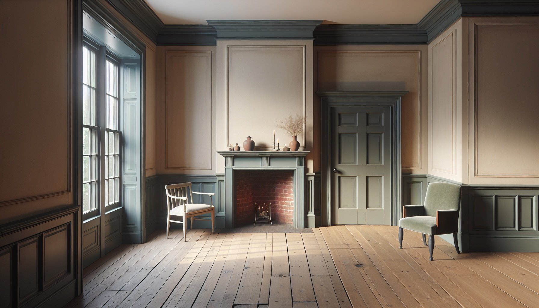
Colonial interiors leaned on quiet, workhorse colors that softened hard edges and made simple rooms feel settled. Inside, gentle creams, warm putty grays, and softened brick reds balanced flickering firelight and limited daylight, creating calm, practical spaces for daily life. Woodwork often carried slightly deeper tones than walls, giving doors, chair rails, and mantels a grounded, architectural presence. Accents arrived through dusky blues, mossy greens, and lampblack trims that framed windows and hearths without feeling showy. These time-tested combinations still translate beautifully, guiding modern restorations toward interior schemes that feel both historic and comfortably livable today.
Soft earth-toned interiors: ochres, umbers, and clay-based neutrals for walls and paneling
Soft earth-toned interiors brought quiet depth to colonial rooms, with walls and paneling finished in pigments pulled straight from local soil. Ochres ranged from soft straw to deep mustard, giving keeping rooms and stair halls a gentle glow that held up under candlelight. Burnt umber and warm brown washes grounded lower paneling and dado rails, hiding scuffs while echoing the color of well-used pine floors. Clay-based neutrals, tinted with iron-rich earth, created putty, mushroom, and stone shades that softened sharp architectural lines without losing structure. Modern restorations often layer these hues—pale clay on walls, richer umber on paneling, and warm ochre in accent doors—to keep historic bones visible while creating calm, livable spaces that age gracefully.
Expert Insight: By 2025, the global market for heritage-inspired paints, including colonial palettes, is projected to grow at a 5.2% CAGR, driven by restoration projects and cultural preservation initiatives.
Source: Statista
Historic blues, greens, and grays: indigo, copper-based greens, and soot-mixed hues for cabinetry and built-ins
Historic blues, greens, and grays added cool contrast to the warmer ochres and umbers found on colonial walls, especially on cabinetry, built-ins, and doors. Deep, slightly muted blues came from indigo and were often reserved for more finished rooms, creating a calm, shaded backdrop for pewter, pottery, and simple pine shelving. Copper-based greens produced soft blue‑greens and sage tones, popular on corner cupboards, wainscoting, and window seats where durability and character mattered. Soot and charcoal mixed into lime or oil binders produced versatile grays that disguised wear on mantels, interior doors, and stair spindles. Modern restorations echo these palettes with blue‑black hutches, gray‑green kitchen cabinets, and smoke‑tinted built-ins that feel both historically grounded and quietly sophisticated.

Good to Know: Colonial-era paint palettes in America primarily used earth tones like reds, yellows, and greens derived from natural pigments, reflecting the limited availability of synthetic dyes before the 19th century.
Source: John Canning & Co.
Balancing authenticity and practicality: modern paints that mimic historic colors while resisting moisture and heat
Modern colonial-style interiors often rely on advanced paint formulas that echo the depth and softness of traditional pigments while standing up to today’s living conditions. Low-sheen acrylic and alkyd blends can recreate the chalky look of limewash ochres or soot-tinted grays, but with strong resistance to steam, grease, and sunlight. Historic paint lines now match documented 18th‑century hues—such as blue‑black for mantels or gray‑green for wainscoting—yet include mildew-resistant and heat-tolerant resins ideal for kitchens, baths, and sunny stair halls. Color-saturated enamels on cabinetry and trim hold up to constant handling while keeping that period-appropriate, slightly muted cast. This balance lets colonial palettes feel honest to the past while performing well in busy, climate-controlled homes today.
Conclusion
Colonial color palettes grew from simple needs and natural materials, yet created a look that still feels steady and refined. Quiet, workhorse interiors paired with structured, contrast-rich exteriors shaped a consistent visual language, where whitewashed siding, strong trim lines, and grounded door colors worked alongside softened interior tones and deeper woodwork. Shutters framed windows, architectural details felt intentional, and carefully chosen accent hues added depth without flash. These choices formed a lasting foundation for homes that feel honest, welcoming, and rooted in place. Revisiting these historic paint palettes offers a chance to honor early craftsmanship while refreshing each space with enduring color harmony that suits modern life. A thoughtfully chosen Colonial palette keeps each home classic, comfortable, and truly timeless.
Frequently Asked Questions
- What paint colors are historically accurate for Colonial homes?
- Traditional Colonial home colors came from natural pigments, so the palettes leaned toward muted, earthy tones rather than bright, modern shades. Common historically accurate colors include:
– Soft whites and creams – lime-based whitewash, off-white trim, and light plaster tones
– Warm grays and taupes – made from mixtures of iron oxides, charcoal, and clay
– Brick reds and oxblood – iron oxide pigments produced deep red siding and doors
– Soft yellows and straw tones – earth pigments and ochres created warm but subdued yellows
– Sage greens and olive greens – copper- and earth-based pigments produced gray-green shades
– Deep blues (Prussian blue, indigo) – used more sparingly and often in wealthier homesColors were typically low-sheen and slightly duller than many modern paints. This softer look helped Colonial houses blend into natural surroundings while still offering pleasing contrast between siding, trim, and shutters.
- How can a modern Colonial-style home use historic paint palettes without looking outdated?
- A modern Colonial-style home can feel fresh and current while still honoring historic colors by focusing on balance, contrast, and finish. Several strategies work well:
– Use historic colors in updated combinations: Pair traditional cream siding with a sharp black or deep charcoal door and shutters for a classic but crisp look.
– Choose slightly cleaner versions of historic hues: Select grays, greens, and reds that are rooted in earth tones but have less muddiness than original pigments.
– Limit bold colors to accents: Keep siding and trim neutral (white, cream, taupe) and reserve deep blue, red, or green for the front door, shutters, or porch ceiling.
– Match paint sheen to the home’s character: Historic homes often appear more authentic with matte or eggshell siding and satin trim instead of high-gloss finishes.
– Respect the architecture: Emphasize features such as cornices, window trim, and paneled doors with slightly contrasting tones to highlight Colonial details.This approach keeps the historic spirit of Colonial palettes while fitting comfortably in modern neighborhoods and new construction.
- What are some common Colonial-era color schemes for siding, trim, and shutters?
- Many Colonial-era color schemes follow a simple structure: subdued siding, lighter trim, and darker accent colors for shutters and doors. Popular historic combinations include:
1. Classic New England look
– Siding: Soft white or light cream
– Trim: Bright white or warm off-white
– Shutters/Door: Deep forest green or near-black2. Traditional brick Colonial
– Siding: Natural red brick
– Trim: Cream, buff, or light gray
– Shutters/Door: Black, dark green, or deep brown3. Warm earth-tone farmhouse
– Siding: Muted tan, putty, or taupe
– Trim: Cream or pale stone
– Shutters/Door: Oxblood red or dark olive green4. Refined coastal Colonial
– Siding: Light gray or weathered-shingle tone
– Trim: Crisp white
– Shutters/Door: Navy, slate blue, or charcoalThese schemes use low to medium contrast and avoid overly bright or neon colors, which keeps the overall appearance calm, timeless, and in line with historic Colonial style.
- How did early Colonists choose paint colors, and why were they often muted?
- Early Colonists chose paint colors based on availability, cost, and practicality, not fashion trends. Colors stayed muted for several reasons:
– Natural pigments only: Early paint colors came from earth, minerals, lime, and plant-based dyes. These ingredients produce softer, less intense colors than many synthetic modern pigments.
– Cost and status: Deep, rich colors such as strong blues or fine greens could be expensive, so they appeared more often in wealthy homes or in small areas like front doors or interior trim.
– Durability and weathering: Earth tones, iron oxides, and lime-based whites held up better outdoors, fading gracefully instead of peeling into bright flakes.
– Practical appearance: Soft browns, grays, and creams helped hide dirt, smoke, and everyday wear, which was important when maintenance was more difficult.These limitations led to the characteristic Colonial look: calm, weathered colors that blend well with brick, stone, and natural landscapes.
- What paint finishes work best to achieve an authentic Colonial look?
- The most authentic Colonial appearance comes from subtle, low-sheen finishes that hint at old hand-mixed paints and limewash. Good finish choices include:
– Matte or flat for siding: Creates a soft, chalky look similar to historic whitewash and early oil paints. It helps hide surface imperfections on older exteriors.
– Eggshell for siding in high-traffic areas: Still low-sheen but slightly more washable than flat, which works well for modern maintenance needs.
– Satin for trim and doors: Provides gentle sheen that highlights details like window casings, railings, and paneled doors without looking overly glossy.
– Avoid high-gloss on large areas: Strong gloss reads more mid‑20th‑century than Colonial and can make traditional colors appear too sharp or plastic.Combining a matte or eggshell body with satin trim usually delivers the right mix of historic character and modern durability.
- How can historic Colonial colors be adapted for interior spaces?
- Historic Colonial colors translate nicely indoors by using softened versions of exterior shades and pairing them with warm neutrals. Effective interior adaptations include:
– Walls in soft neutrals: Warm whites, light grays, pale beige, or putty tones create a comfortable background that echoes plaster and old limewash.
– Accent walls or millwork in richer tones: Deep blue, oxblood red, or mossy green on wainscoting, built‑ins, or a single feature wall add Colonial character without darkening the whole room.
– Contrasting trim: Cream or off‑white trim against slightly darker walls reflects the way early interiors highlighted doors and windows.
– Historic-inspired blues and greens in specific spaces: Muted blues in dining rooms and studies, soft greens in entries and sitting rooms, and warm golds in gathering spaces call back to period color use.When interior colors stay grounded in earth tones and mineral-inspired hues, spaces feel calm, warm, and quietly traditional while still fitting modern furniture and finishes.
- How can existing brick or stone be coordinated with a Colonial paint palette?
- Brick and stone play a major role in Colonial architecture, so exterior paint needs to coordinate rather than compete. Several guidelines help align masonry with a Colonial palette:
– Pull colors from the masonry: Identify the main undertones in the brick or stone—red, brown, buff, gray—and choose siding and trim colors that echo those shades.
– Use warm neutrals beside warm brick: Cream, ivory, tan, or warm gray work well with red or orange-toned brick common in many Colonial homes.
– Pair cool grays with blue‑gray stone: Slate and fieldstone often look best with soft gray or light greige siding and crisp white or off‑white trim.
– Keep the front door and shutters deeper: Deep green, black, navy, or oxblood red usually complement both brick and stone and line up with traditional Colonial accent colors.
– Avoid extremely bright whites against heavily textured brick, since they can appear harsh and out of place with historic materials.This approach lets natural brick or stone remain the visual anchor while painted elements reinforce a timeless Colonial look.